Sometimes data that you need is not easily accessible. I experienced this when I wanted to visualize water advisories for First Nation communities across Canada as an interactive map. I found the data from two sources: (1) Government of Canada and (2) First Nations Health Authority (FNHA). The former had the desired data for all provinces south of 60, except for in British Columbia (BC), so the latter source was used to obtain BC data.
Unfortunately, the data was not able to be downloaded. To overcome this barrier, I decided scrapping the sites' XML was the best solution to obtain the data. Since I had some experience using XPath in Google Sheets to scrape sites' DOMS, I decided to approach the visualization with the following work flow:
This approach allows the visualiztion to be dynamic, which I will detail more below. If you want to check out the complete code, view the repo.
Google Sheets + XPath
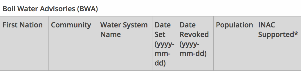
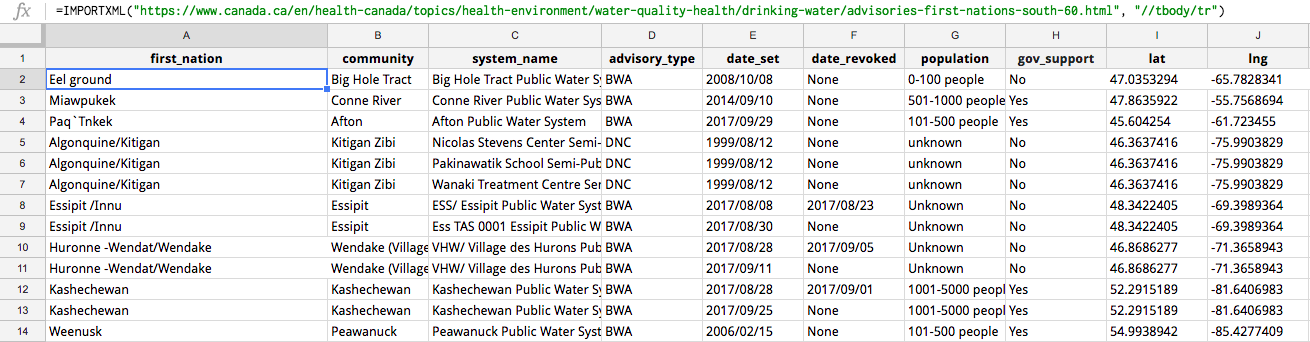
XPath (XML Path Language) is a query language for obtaining nodes from a XML document (e.g., a website). You can read more about XPath and the query syntax here. In Google Sheets you can use the =IMPORTXML("[url]", "[XPath query]") function to use XPath to scrape a site's XML. As can be seen in the two images below, the two data sources had different ways of presenting the data, so I had to account for this when scraping the sites.

I used the following queries to scrape the data from the two different sources:
Basically the two queries pulled each site's tables' rows into the Google Sheet, so each tables' row was added as its own row into Google Sheets. I decided to create two separate sheets, one to scrape the Government of Canada data and the second one to scrape the FNHA data. That said, I needed only one sheet to import the data into JS with TableTop. Since FNHA data was smaller, I decided to clean the data its separate sheet to match the Government of Canada's data, and then import the cleaned FNHA data into the same sheet as the Government of Canada data using the =query() function. (It would have been nice if the two different sources released their data in the same format, because then these steps would not have been necessary. This is why data standards are valuable!). Also, I wanted to make the data cleaning as automated as possible with Google Sheet functions because data is automatically scraped from the sites into the Google Sheets with the XPath queries.
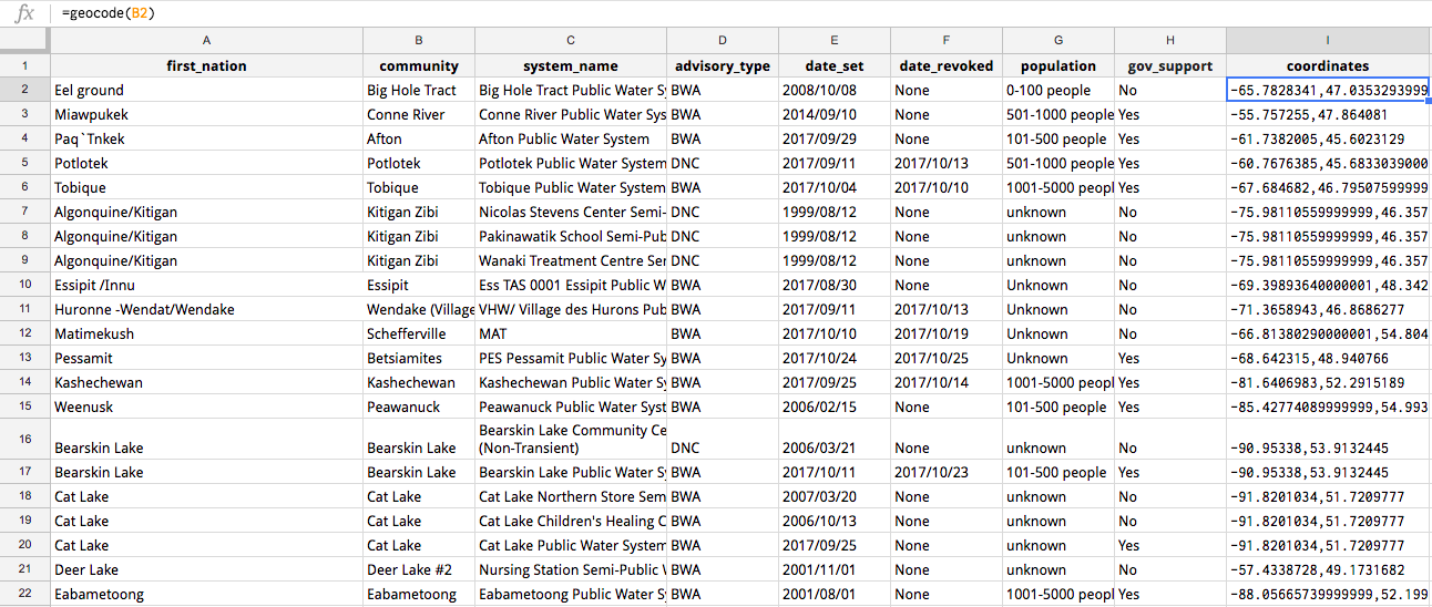
With the necessary data all in one sheet, the next step was geocoding the data so that I could plot the x,y coordinates onto an interactive map. Initially I used an already existing Google Sheets Add-on called "Geocode Cells," which uses the Google Maps API to geocode a sheet's column into two additional columns (lat and lng). The results can be seen in the image below.
However, this methods prevents the geocoding being automatic when new rows are scraped from the data sources; thus, I created my own function =geocode() that geocodes the "community" column's cells. I created the function in the Google Script Editor (in Google Sheets go to Tools > Script editor...). The code can be seen below:
The script uses the Google Maps Geocoding API to match the cell's name with x,y coordinates.
Having an automatic geocoder is useful for a dynamic dataset, but a human eye is still necessary to ensure the geocoding is accurate. The geocoder Add-on used the "Community" column names; but, if a First Nation's community name also exists in a different location, then the geocoder may pick up that location instead. For example, the geocoder geocoded the "Big Island" community to Big Island, Hawaii.
TableTop
With all the data cleaned in Google Sheets, the next step was pulling the data into JavaScript with the TableTop. Firstly, I had to make my Google Sheet public so that TableTop could access the data. Secondly, I created index.html to be able to use the TableTop and Mapbox GL JS libraries in JavaScript. Thirdly, I created index.js to write my JS code. In index.js I had to used the following code to use TableTop to import the Google Sheet data:
Basically this code initializes TableTop and then showInfo(data, tabletop) imports the data as a JSON. Now the Google Sheet data was imported and ready to be manipulated and visualized.
Mapbox GL JS
Firstly, you must add the following code to index.js to have a map exist in index.html:
At this point index.js should look like this:
And index.html should look this this:
Within showInfo() I had to create the lat and lng columns into a GeoJSON feature class of points. I also added properties in the GeoJSON so that I could add popups with information regarding each point, such as the name of the First Nations community and when the advisory was set. The follow code shows how I created the feature class:
Then with Mapbox GL JS, I had to create a new GeoJSON data source as well as a new map layer so that the data could actually appear on the Mapbox map:
Now Mapbox map should be populated with points/markers that are coloured based on advisory type. I added filter features and point/marker popups to the interactive map, but I won't detail them in this tutorial. Check out the complete code to see how these additional features were added. Also, check out the Mapbox docs on how to "Display a popup" and "Show changes over time".